The plot() function is a function under the matplotlib.pyplot module, which is used for drawing. It can draw points and lines and control their styles. This article will tell you how to use it with some examples.
1.plt.plot(x, y).
- The plot() method can accept multiple parameters.
- The parameters type can be List, Tuple, Array, Series, DataFrame, etc.
- If you pass only one parameter for example plot([6,9,6]), it will apply the parameter’s value to the y-axis.
- In such a case the x-axis value will start from 0 and ends with the y-axis list object’s length – 1.
- For example, if the passed-in list is [6, 9, 6], then the omitted x list value should be [0, 1, 2].
- Below will show some examples of how to use the plot() method.
1.1 x is a list, y is a list.
- Below is the basic plot function example.
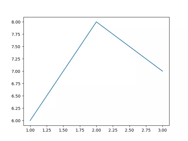
# import the matplotlib.pyplot module. import matplotlib.pyplot as plt def basic_plot(): # The number of x and y list elements should be the same # The x list is the X-axis data x=[1,2,3] # The y-list is the Y-axis data y=[6,8,7] # call the plot function to draw the figure. plt.plot(x,y) # show the figure. plt.show() if __name__ == '__main__': basic_plot() - Below is the above example generated figure, you can see there are 3 key points which coordinates are (1, 6), (2, 8), (3, 7).
1.2 x is a Tuple, y is an Array or Series.
- Below is the example code.
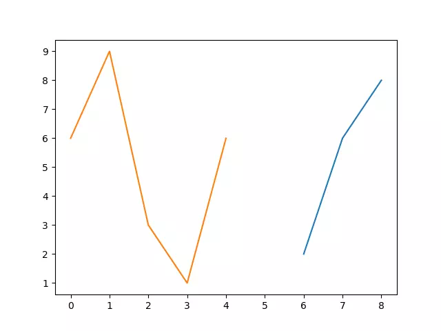
# import the matplotlib.pyplot module. import matplotlib.pyplot as plt import numpy as np import pandas as pd def x_tuple_y_array_series(): # x is a tuple. x = (6,7,8) # y1 is an NumPy array. y1=np.array([2,6,8]) # y2 is a Pandas Series object. y2=pd.Series([6,9,3,1,6]) # plot the first figure. plt.plot(x, y1) # plot the second figure, when you pass only one parameter, it will apply the input parameter to the y-axis value. # When x is omitted, the default value of x is an incremented array like [0,1.., n-1], the x array's length is same with y2. plt.plot(y2) # call the plt.show() method to display the multiple figures in the same convas added above. plt.show() if __name__ == '__main__': x_tuple_y_array_series() - Below is the above example generated graph.
1.3 Pass multiple groups of x and y.
- When you pass multiple groups of x and y, you can not omit x.
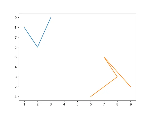
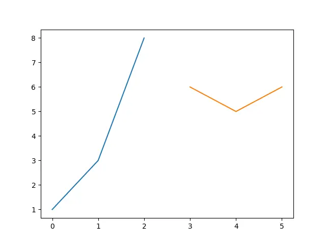
# import the matplotlib.pyplot module. import matplotlib.pyplot as plt import numpy as np import pandas as pd def pass_multiple_x_y_group(): # define the first tuple x1. x1=(1,2,3) # define the first array y1. y1=np.array([8,6,9]) # define the second list x2. x2=[6,8,7,9] # define the second Series object y2. y2=pd.Series([1,3,5,2]) # plot the 2 figures by passing in the above 2 x,y groups, you can not ignore x in this style. plt.plot(x1,y1,x2,y2) # show the above 2 figures on the same canvas. plt.show() if __name__ == '__main__': pass_multiple_x_y_group() - Below is this example-generated figure.
1.4 Pass in pandas DataFrame objects to x or y.
- The below example will pass in DataFrame objects to x or y.
# import the matplotlib.pyplot module. import matplotlib.pyplot as plt import numpy as np import pandas as pd def pass_dataframe_x_y(): # create the x dictionary. dic1={'x-col-0':[0,1,2],'x-col-1':[3,4,5]} # create the DataFrame object x. x=pd.DataFrame(dic1) # create the y dictionary. dic2={'y-col-0':[1,3,8],'y-col-1':[6,5,6]} # create the DataFrame object y. y=pd.DataFrame(dic2) # print out the above x, y DataFrame objects. print(x) print(y) # plot the figures based on the above DataFrame objects. plt.plot(x,y) # display the figures. plt.show() if __name__ == '__main__': pass_dataframe_x_y() - Below is the console output.
   x-col-0  x-col-1
0        0        3
1        1        4
2        2        5
   y-col-0  y-col-1
0        1        6
1        3        5
2        8        6
- Below is the example created figure.
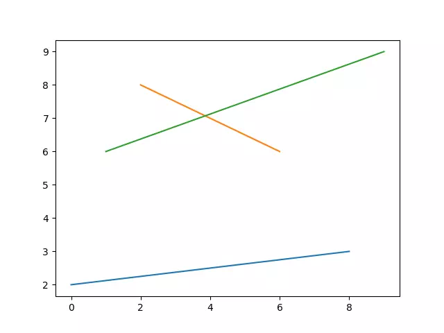
1.5 Pass in a two-dimensional array to x and y.
- Below is the example source code, it will draw 3 lines because there are 3 elements in each array element.
# import the matplotlib.pyplot module. import matplotlib.pyplot as plt import numpy as np import pandas as pd def pass_in_2_dimension_array(): # define a 2-dimension list object list1. list1 = [[0,2,1],[8,6,9]] # create the 2-dimension array based on the above list object. x=np.array(list1) print(x) # define another 2-dimension list object list2. list2 = [[2,8,6],[3,6,9]] # create the 2-dimension array based on the second list object. y=np.array(list2) print(y) # plot 3 lines on the canvas, because each sub array contains 3 elements. # the first line's axis is ((0,2) --- (8,3)), the second line's axis is ((2,8) --- (6,6)), the third line's axis is ((1,6) --- (9,9)). plt.plot(x,y) # show the canvas. plt.show() if __name__ == '__main__': pass_in_2_dimension_array() - Below is the console output.
[[0 2 1]
 [8 6 9]]
[[2 8 6]
 [3 6 9]]
- Below is the source code created figure.
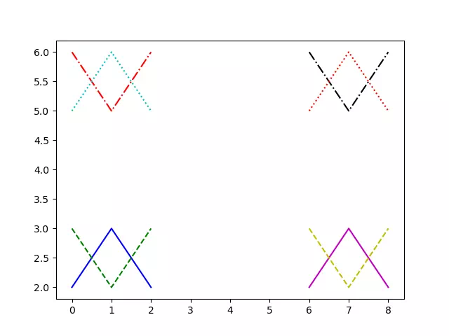
1.6 Pass in the format string.
- The format of colors, markers, and lines can be set with a format string.
- The format string can include up to three parts: color, marker, and line type.
- If you only want to control the line color, you can also enter the full English name of the format string, such as “red“, or even hexadecimal RGB string, such as “#FF0000“.
- Below is the example source code.
# import the matplotlib.pyplot module. import matplotlib.pyplot as plt import numpy as np import pandas as pd def color_and_line_style(): # define a color style list. color_style=['b','g','r','c','m','y','k','r'] # define a line style list. line_style=['-','--','-.',':'] # define the first dictionary object. dict_1 = [[0,1,2],[6,7,8]] # create a DataFrame object based on dict_1. x=pd.DataFrame(dict_1) # define the second dictionary object. dict_2 = [[2,3,2],[3,2,3],[6,5,6],[5,6,5]] # create a DataFrame object based on dict_2. y=pd.DataFrame(dict_2) # loop the x-axis value DataFrame object. for i in range(2): # get the x-axis value( an array ). x_axis_array = x.loc[i] # loop the y-axis value DataFrame object. for j in range(4): # get the y-axis value( an array ). y_axis_array = y.iloc[j] # loop through all colors and lines style. # get one color. color = color_style[i*4+j] # get one line type style. line = line_style[j] # plot the figure based on the above x_axis, y_axis value and color and line type. plt.plot(x_axis_array,y_axis_array,color+line) plt.show() if __name__ == '__main__': color_and_line_style() - Below is the above example code generated figure. We can see there are 8 color lines with different colors and line typs (((0,2)-(1,3)-(2,2)-b-), ((0,3)-(1,2)-(2,3)-g–), ((0,6)-(1,5)-(2,6)-r-.), ((0,5)-(1,6)-(2,5)-c:), ((6,2)-(7,3)-(8,2)-m-), ((6,3)-(7,2)-(8,3)-y–), ((6,6)-(7,5)-(8,6)-r-.), ((6,5)-(7,6)-(8,5)-r:)).
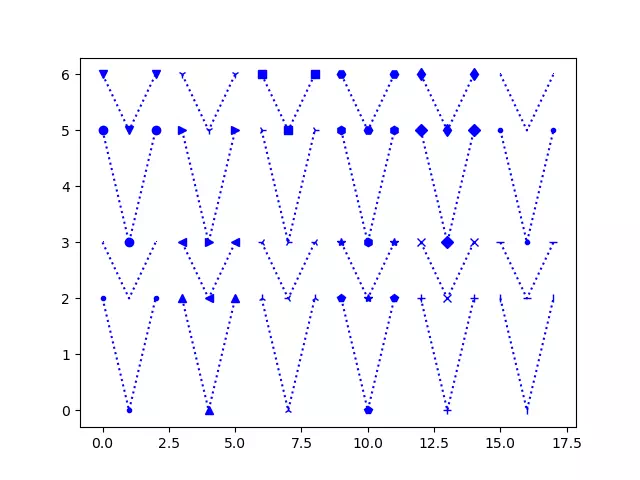
- The below example demonstrate how to use Markers when invoking the plot() method to draw figures.
# import the matplotlib.pyplot module. import matplotlib.pyplot as plt import numpy as np import pandas as pd def plot_markers_example(): # define a list that contains 24 markers. marker_list=['.',',','o','v','^','<','>','1','2','3','4','s','p','*','h','H','+','x','D','d','|','_','.',','] print('This example will demo ', len(marker_list),' markers.') # define the x-axis value list. dict_1=[[0,1,2],[3,4,5],[6,7,8],[9,10,11],[12,13,14],[15,16,17]] x=pd.DataFrame(dict_1) # define the y-axis value list. dict_2=[[2,0,2],[3,2,3],[5,3,5],[6,5,6]] y=pd.DataFrame(dict_2) # loop the x-axis value data list. for i in range(6): # loop the y-axis value data list. for j in range(4): # get the x-axis value data array. x_axis_array = x.iloc[i] # get the y-axis value data array. y_axis_array = y.iloc[j] # set the line color to blue. color_type = 'b' # get a marker type from the marker list. marker_type = marker_list[i*4+j] # set line type to dot type. line_type = ':' # create the figure color, marker, and line type. figure_type = marker_type + color_type + line_type # plot the figure with the above settings. plt.plot(x_axis_array, y_axis_array, figure_type) plt.show() if __name__ == '__main__': plot_markers_example() - Below is the above example source code generated figure.
1.7 Pass in keywords.
- When you call the plot() method, in addition to the “format string“, you can also add the keyword = parameter after it.
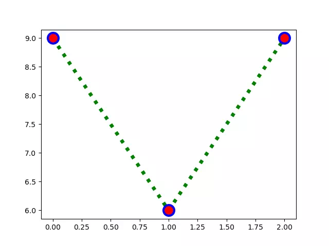
- The below example will show you some keyword parameters to change the figure line width, marker size, marker color, and marker edge color, etc.
# import the matplotlib.pyplot module. import matplotlib.pyplot as plt import numpy as np import pandas as pd def plot_with_keywords(): # define the y-axis value list. y=[9,6,9] # 蓝色,线宽20,圆点,点尺寸50,点填充红色,点边缘宽度6,点边缘灰色 # the line color is green. color_type = 'g' # the line type is dot line. line_type = ':' # set the line width to 10. line_width = 5 # set marker type to o. marker_type = 'o' # set marker size to 5. marker_size = 15 # set marker face color. marker_face_color = "red" # set marker edge width marker_edge_width = 3 # set marker edge color. marker_edge_color ="blue" # plot the figure with the above settings. plt.plot(y, color_type + line_type, linewidth=line_width, marker=marker_type, markersize=marker_size, markerfacecolor=marker_face_color, markeredgewidth=marker_edge_width, markeredgecolor=marker_edge_color) # display the canvas. plt.show() if __name__ == '__main__': plot_with_keywords() - Below is the figure generated by the above example source code.