This article will show you 3 examples. The first example tells you how to change the Matplotlib plot axis scale, the second example tells you how to change the axis range, and the third example tells you how to make the DateTime value displayed on the axis adaptively.
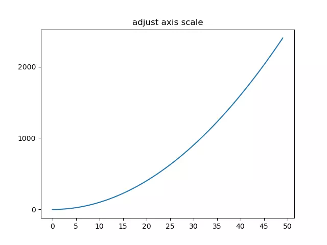
1. How To Change The Matplotlib Plot Axis Scale.
- You can use the matplotlib.pyplot module’s locator_params() method to change the axis scale.
- You can adjust the x-axis and y-axis at the same time with the code plt.locator_params(nbins = 10).
- You can also adjust only the x-axis with plt.locator_params (‘x ‘, nbins = 10) or only adjust the y-axis with plt.locator_params(‘y’,nbins = 10).
- Below is the example.
import numpy as np import matplotlib.pyplot as plt def change_axis_scale(): # create a numpy array. x=np.arange(0,50,1) # plot the curve by x value. plt.plot(x,x*x) # set the plot title. plt.title('adjust axis scale') # get the axes object. ax=plt.gca() # adjust the y axis scale. ax.locator_params('y', nbins=5) # adjust the x axis scale. plt.locator_params('x', nbins=20) # show the final figure. plt.show() if __name__ == '__main__': change_axis_scale() - Below is the figure when you run the above example code.
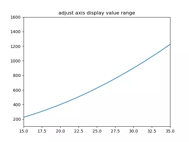
2. How To Change The Matplotlib Plot Axis Value Display Range.
- Use the matplotlib.pyplot module’s xlim(xmin, xmax), ylim(ymin, ymax) method to adjust the axis value display range.
- Below is the example source code.
import numpy as np import matplotlib.pyplot as plt def change_axis_range(): # create an integer number array. x=np.arange(0,50,1) # plot the curve. plt.plot(x,x*x) # set the plot title. plt.title('adjust axis display value range') # only show 15 - 35 on x-axis. plt.xlim(xmin=15,xmax=35) # only show 100 - 1600 on y-axis. plt.ylim(ymin=100,ymax=1600) # show the plot. plt.show() if __name__ == '__main__': change_axis_range() - When you run the above example source code, you can get the below plot.
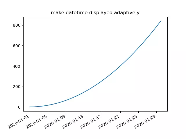
3. How To Make Datetimes Displayed Adaptively In Matplotlib Axis.
- You can call the matplotlib.pyplot module’s gcf() method to get the current figure object.
- Then call the current figure object’s autofmt_xdate() method to make the date times string displayed adaptively on the related axis. Below is the example, you can remove the code ( current_figure.autofmt_xdate() ) to see the difference.
import pandas as pd import numpy as np import matplotlib.pyplot as plt def change_datetime_adaptively(): # create a date range (30 days) array. x=pd.date_range('2020/01/01',periods=30) print(x) # create a numpy array. y=np.arange(0,30,1) # plot the curve, the x-axis is date and the y-axis is integer number. plt.plot(x,y*y) # set the plot title. plt.title('make datetime displayed adaptively') # get the current figure. current_figure = plt.gcf() # make the datetime displayed adaptively. current_figure.autofmt_xdate() # show the plot. plt.show() if __name__ == '__main__': change_datetime_adaptively() - Below is the figure when you run the above source code.