The android.graphics.drawable.LayerDrawable is a drawable object that manages arrays of other drawable objects in the desired order. Each drawable object in the layer list is drawn in the order of the list, and the last drawable object in the list is drawn at the top.
1. How To Define Android Layer List.
- To define a LayerDrawable object, you need to add an XML file under the app/res/drawable folder. And the file name is just the drawable resource id. In this example, the app/res/drawable/my_layer_list.xml file contains a layer list definition.
- In the layer list definition XML file, each drawable object is represented by a <item> element within a single <layer-list> element. You can add any <bitmap> or <shape> sub-elements under the <item> element. You can read Android Shape, Selector Examples to learn how to create shapes drawable in android.
- To use the above layer-list drawable resource, you can use the below methods.
- Call the layer-list drawable resource in java source code by id: R.id.my_layer_list.
- Call the layer list drawable resource in Xml Code: @drawable/my_layer_list.
2. Layer-list Three Layer Example.
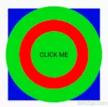
There is a button in this example, as shown above, it uses a three-layer layer-list drawable object as the background.
my_layer_list.xml
<layer-list xmlns:android="http://schemas.android.com/apk/res/android">
    <!-- The bottom layer is blue square.-->
    <item
        android:left="5dp"
        android:top="5dp"
        android:right="5dp"
        android:bottom="5dp">
        <shape>
            <solid android:color="@color/colorBlue" />
            <size android:height="200dp"
                   android:width="200dp" />
        </shape>
    </item>

    <!-- The middle layer is green circle.-->
    <item>
        <shape android:shape="oval">
            <size
                android:width="100dp"
                android:height="100dp" />
            <solid android:color="@color/colorGreen" />
        </shape>
    </item>

    <!-- The top layer is red ring.-->
    <item
        android:left="30dp"
        android:top="30dp"
        android:right="30dp"
        android:bottom="30dp">
        <shape
            android:shape="ring"
            android:thickness="25dp"
            android:useLevel="false">
            <solid android:color="@color/colorRed" />
        </shape>
    </item>
</layer-list>
layout XML code use above layer-list.
<Button
    android:id="@+id/selectorButton"
    android:layout_width="wrap_content"
    android:layout_height="wrap_content"
    android:background="@drawable/my_layer_list"
    android:text="Click Me"/>
3. Layer-list Image Border Example.
Above example add two borders for an image. If you want to left only one border. You can remove <stroke> element to remove green border, remove <solid> element or change <padding> value to 5dp to remove red border.
my_layer_list.xml
<layer-list xmlns:android="http://schemas.android.com/apk/res/android">
    <!-- The bottom layer is red color rectangle with green border. -->
    <item>
        <shape android:shape="rectangle">
            <solid android:color="@color/colorRed" />
            <stroke
                android:width="5dp"
                android:color="@color/colorGreen" />
            <padding
                android:left="15dp"
                android:top="15dp"
                android:right="15dp"
                android:bottom="15dp" />
            <size
                android:width="100dp"
                android:height="100dp" />
        </shape>
    </item>
    <!-- The top layer is an image. -->
    <item android:drawable="@drawable/img6" />
</layer-list>
4. Layer-list Red Crosshair Example.

There are two-layer in this example. The bottom layer draws the vertical line and the top layer draws the horizontal line. You can adjust the layer item’s top, bottom, left, and right offset to change the crosshair center point.
my_layer_list.xml
<layer-list xmlns:android="http://schemas.android.com/apk/res/android">
    <!-- Draw the vertical line, left edge move to right 100dp and right edge move to fight 200dp. -->
    <item
        android:left="100dp"
        android:right="200dp">
        <shape>
            <size android:width="10dp" />
            <solid android:color="@color/colorRed" />
        </shape>
    </item>
    <!-- Draw the horizontal line, top edge move down 100dp and bottom edge move down 200dp. -->
    <item
        android:top="100dp"
        android:bottom="200dp">
        <shape>
            <size android:height="10dp" />
            <solid android:color="@color/colorRed" />
        </shape>
    </item>
</layer-list>
5. Layer-list Heart Example.
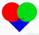
There are three layers in this example.
- The bottom layer is a blue square that rotates 45-degree rotation.
- The middle layer is a red oval.
- The top layer is a green oval.
You can adjust each layer’s item offset to change the heart border and shape. If you set the same color for both three-layer. You can see a heart picture.
my_layer_list.xml
<layer-list xmlns:android="http://schemas.android.com/apk/res/android">
        <!-- The bottom layer is a blue square rotate 45 degree rotation. -->
        <item
            android:top="76dp"
            android:bottom="42dp"
            android:left="66dp"
            android:right="66dp">
            <rotate android:fromDegrees="45">
                <shape>
                    <solid android:color="@color/colorBlue" />
                    <size
                        android:width="100dp"
                        android:height="100dp" />
                </shape>
            </rotate>
        </item>
        <!--The middle layer is a red oval.-->
        <item
            android:bottom="90dp"
            android:right="100dp">
            <shape android:shape="oval">
                <solid android:color="@color/colorRed" />
            </shape>
        </item>
        <!--The top layer is a green oval. -->
        <item
            android:bottom="90dp"
            android:left="100dp">
            <shape android:shape="oval">
                <solid android:color="@color/colorGreen" />
            </shape>
        </item>
</layer-list>
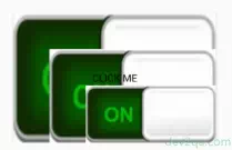
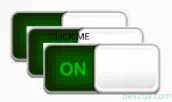
6. Layer-list Bitmap Example.
By default, all rendering items are scaled to fit the size of the included view. Therefore, placing the image at different locations in the layer list may increase the size of the view, and some of the images will scale accordingly.
To avoid scaling items in a list, use <bitmap> elements within <item> elements to specify drawable objects, and define gravity for some items that are not scaled (such as “center”). The below layer-list do not add gravity attribute for bitmap, so the picture has been scaled.
my_layer_list.xml
<layer-list xmlns:android="http://schemas.android.com/apk/res/android">
    <item>
        <bitmap android:src="@drawable/toggle_button_on" />
    </item>
    <item android:top="50dp" android:left="50dp">
        <bitmap android:src="@drawable/toggle_button_on" />
    </item>
    <item android:top="100dp" android:left="100dp">
        <bitmap android:src="@drawable/toggle_button_on" />
    </item>
</layer-list>
If you add android:gravity=”center” attribute for each bitmap in the above layer-list XML file, you can see the below screen effect.
<bitmap android:src="@drawable/toggle_button_on" android:gravity="center"/>
Thank you!
Thanks alot.
Gracias!