This article will introduce some of the practical tips of Matplotlib ploting.
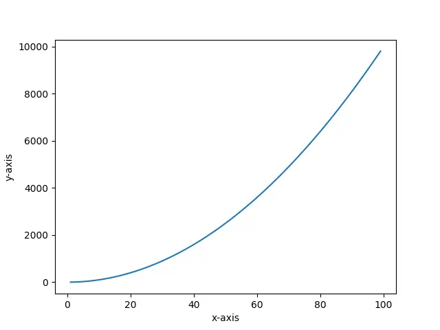
1. How To Set Axis Name With xlabel / ylabel.
- In 2D coordinate drawings, the name and quantity unit shall be indicated on the horizontal axis and vertical axis.
- The methods used to set the coordinate axis name are xlabel() and ylable(). Below is the example.
import numpy as np import matplotlib.pyplot as plt def draw_figure_with_labels(): # create an numpy array x = np.arange(0,100) # set x axis label. plt.xlabel('x-axis') # set y axis label. plt.ylabel('y-axis') # plot the curve. plt.plot(x,x*x) # show the figure canvas. plt.show() if __name__ == '__main__': draw_figure_with_labels() - Below is the picture when you run the above python source code.
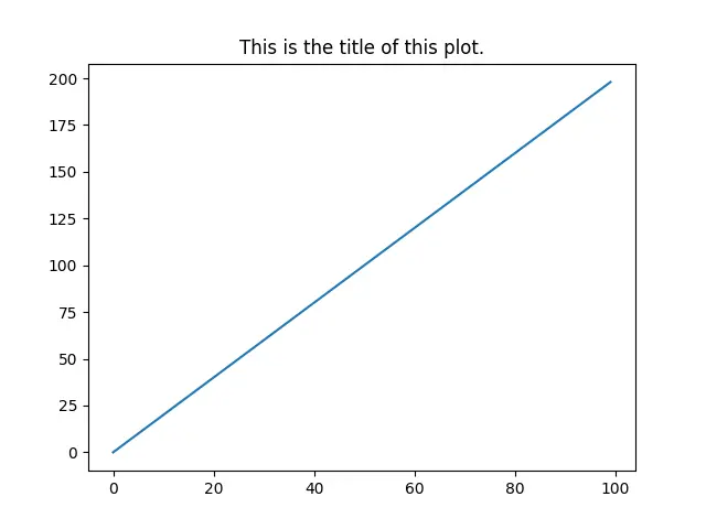
2. How To Set Plot Title.
- You can use the title() method in the matplotlib.pyplot module to set the title of the plot, below is the example source code.
import numpy as np import matplotlib.pyplot as plt def plot_with_title(): # create an array to store the x-axis values. x=np.arange(0,100) print(x) # set the plot title text. plt.title('This is the title of this plot.') # plot the curve. plt.plot(x,x+x) # show the plot. plt.show() if __name__ == '__main__': plot_with_title() - Below is the image generated by the above source code.
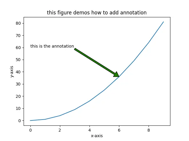
3. How To Add Annotation To Plot.
- We can add annotations in the figure by using the annotate() method.
- Below is the annotate() method syntax format.
annotate(annotation-text, xy, xytext, arrowprops)

xy : the coordinate point's coordinate values, we will add annotation to this point.

xytext : the coordinates of the annotation text (the default is xy position).

arrowprops : attribute of an arrow drawn between xy and xytext.
- Below is the example.
import numpy as np import matplotlib.pyplot as plt def plot_with_annotation(): # get the x-axis value is an array. x=np.arange(0,10,1) # calculate the y value. y=x*x # set title. plt.title('this figure demos how to add annotation') # set x label. plt.xlabel('x-axis') # set y label. plt.ylabel('y-axis') # plot the figure. plt.plot(x,y) # add annotation. plt.annotate('this is the annotation',xy=(6,36),xytext=(0,60),arrowprops={'headwidth':15,'facecolor':'g'}) # display the figure. plt.show() if __name__ == '__main__': plot_with_annotation() - When you run the above example, you will get the below figure.
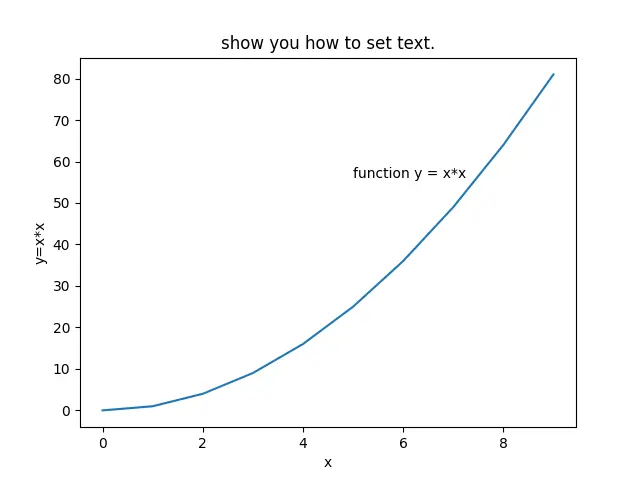
4. How To Add Text To Plot.
- To set coordinates and text, you can use the text(x, y, text-string) method in the matplotlib.pyplot module.
- The first and second parameters are used to set the coordinates of the text, and the third parameter is to set the display text content.
import numpy as np import matplotlib.pyplot as plt def plot_with_text(): x=np.arange(0,10,1) y=x*x plt.plot(x,y) # set title plt.title('show you how to set text.') plt.xlabel('x') plt.ylabel('y=x*x') # add text. plt.text(5, 56, 'function y = x*x') plt.show() if __name__ == '__main__': plot_with_text() - Below is the above example source code generated figure.
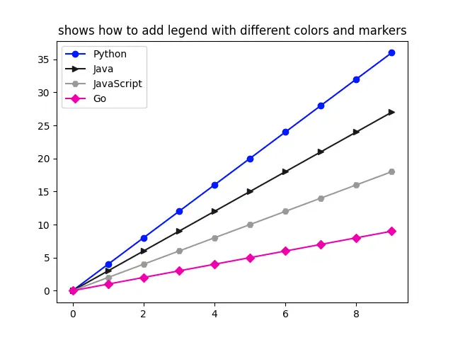
5. How To Add Legend To Plot With Different Colors & Markers.
- When there are too many lines in the plot, we set different colors to distinguish different lines. Therefore, we need to label the lines of different colors. so we use the legend() method to implement it.
- The below example will show you how to create different lines with different colors and markers, it will add a legend to the figure to distinguish the lines.
import numpy as np import matplotlib.pyplot as plt def plot_with_different_legend_colors_markers(): x=np.arange(0,10,1) # plot different curves with different colors and markers. plt.plot(x, x*4, color = 'b', marker='o') plt.plot(x, x*3, color = '0.1', marker='>') plt.plot(x, x*2, color = (0.6,0.6,0.6), marker='H') plt.plot(x, x, color = '#EE00AA', marker='D') plt.title('shows how to add legend with different colors and markers') # add legend to the above figure. plt.legend(['Python','Java','JavaScript','Go']) plt.show() if __name__ == '__main__': plot_with_different_legend_colors_markers() - Below is the above example created figure.